My role: UX Design Lead: Directed user research, and creative team to craft a simpler, more elegant design, and delightful user experience. I was responsible for the the art direction, creating UI components, and assisting in creating protypes in Figma. I presented at milestones and walkthroughs in stakeholders' meetings, and designated tasks to the team enusuring we met deliverable deadlines.
Case Study
This was a UX design and rebranding project to increase product brand awareness, expand interaction and engagement between sales reps and healthcare providers, while increasing sales conversion by showcasing the Glymatrix technology, and ease of use through the power of cohesive visual identity. The OSSIX brand operates in a highly commoditized space, and dentists were often confused about how to use the products.
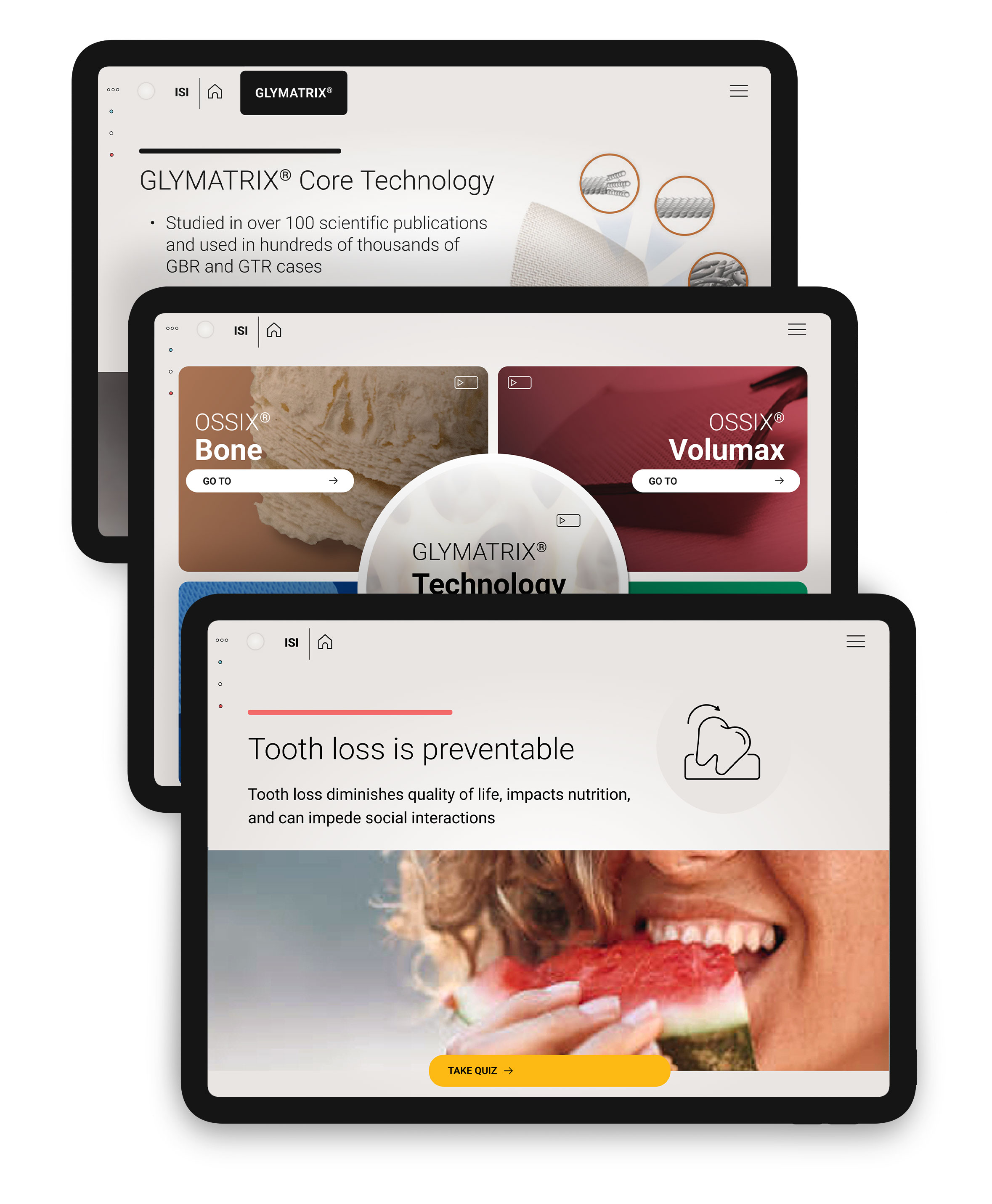
The new DSA is simplified, yet highly engaging to get buy-in from reps who would prefer to direct the dentists to a website where they'd learn about the product on their own.
Objectives
Develop a new comprehensive digital presentation tool that allows the sales team to:
- Gain dentist’s buy-in on the product/tech from the beginning to get them onboard
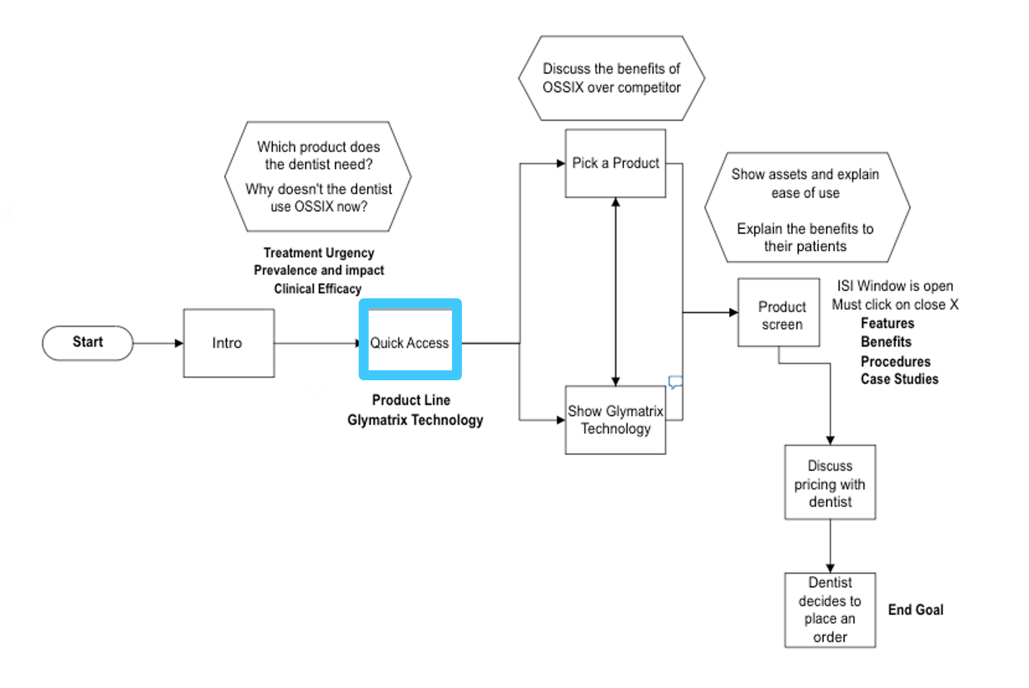
- Establish a clear user flow starting with the unmet need
- Focus on the ease of use of the product and appropriate uses
- Discuss product benefits and application of the full OSSIX Portfolio with customers
- Differentiate from the competition
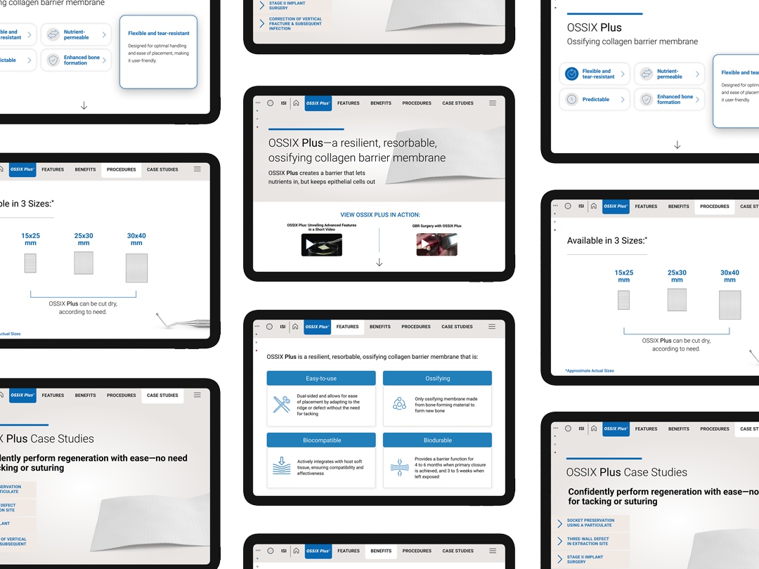
Simpler Navigation
- Quick access to information is necessary—
- A customer call or meeting can be limited to minutes and reps need to access product benefits, differentiation, and instructions for use handily
- Reps need to be able to control the videos to tell the story more easily and quickly
- Content includes an emphasis on the technology that drives the portfolio
WOW—this is beautiful, so much better than we expected!
You've done an amazing job at making this very easy to use, and so elegant. We love it!
The Unmet Need
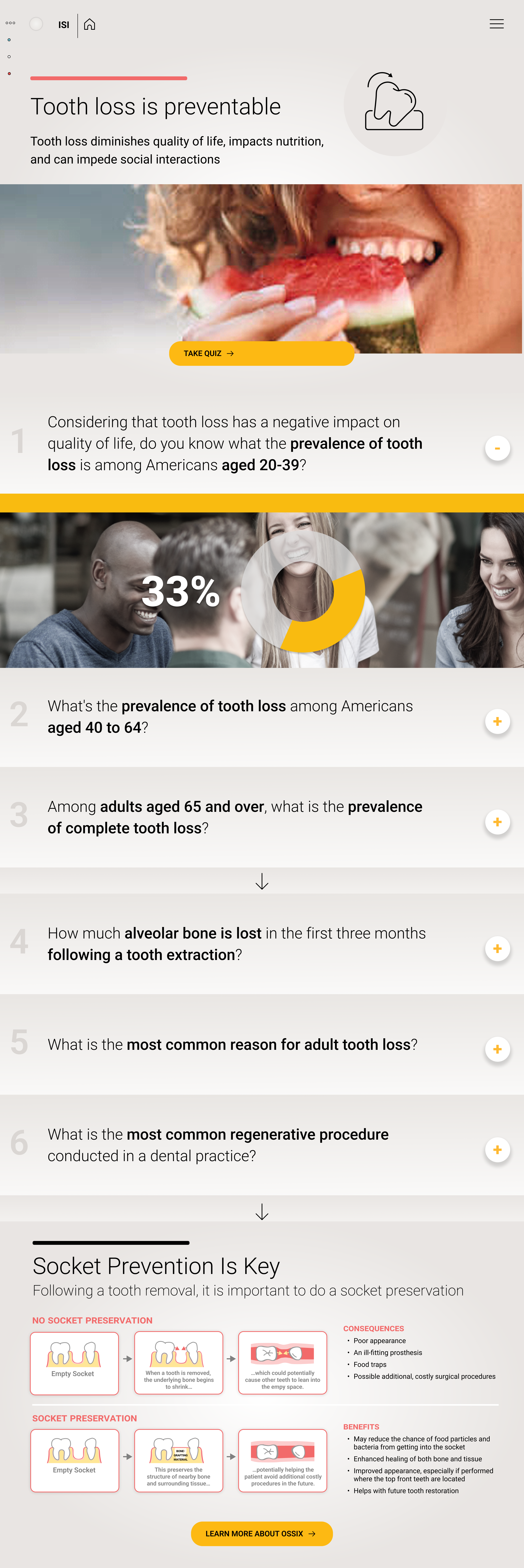
One of the objectives was to create a clear user flow that starts with identifying the unmet need. The DSA begins with the unmet need screen, featuring a quiz designed to engage representatives with their customers—dental healthcare professionals (DHCPs). This quiz aims to raise awareness about the prevalence of tooth loss in adults and the importance of socket prevention. From here, the rep can decide on which product(s) to focus on.
Visual Unity
The unified navigation system integrates various elements into a cohesive structure, enhancing user experience by providing intuitive access to different product sections, and features across the DSA.
In addition, the choice of imagery, and the socket prevention infographic visually highlight the importance of maintaining healthy tooth sockets after tooth loss. This screen includes key statistics on tooth loss prevalence, the causes of socket deterioration, and the benefits of prevention.
The Foundation
By aligning the project goals with the user needs, the foundation was set for a focused, and impactful design executed through collaboration among cross-functional teams.
Research
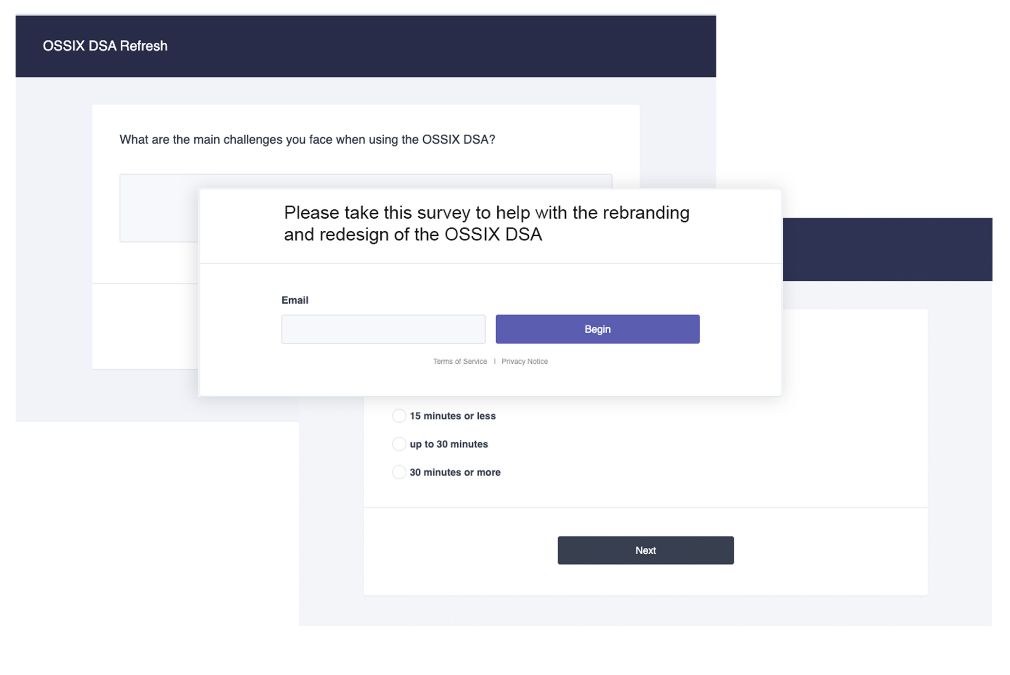
We conducted 2 user interviews remotely, and created a survey that was distributed to the sales rep team. The survey contained 8 questions with mutiple-choice and write-in. There was a 98% response rate (24 reps).
The goal was to:
- Learn which assets are most helpful
- Understand the current user flow
- Idenitfy what is not currently working
- Usability testing—what works well what needs improvement
Insights
From our findings we created a journey map—to learn how reps can interact with the product, and focused on a user flow from the unmet need.
Research Findings:
- NAVIGATION
- Videos/images are important tools to the product story
- FUNCTIONALITY
- A customer meeting can be limited to minutes—reps need access easily and quickly
- CONTENT
- Need for an immediate follow up with customer to keep conversation going
Wireframes
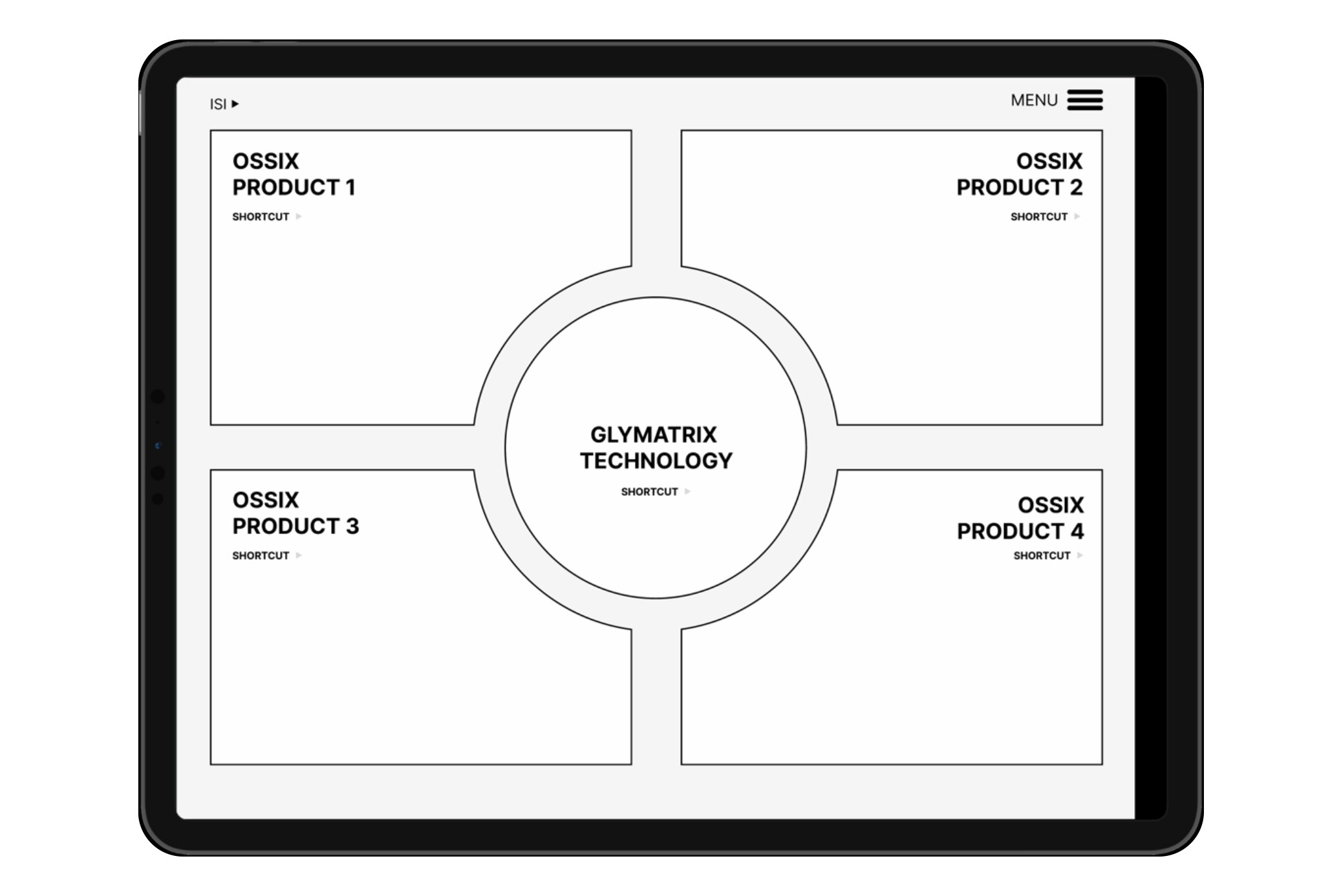
HOME PAGE—EASY ACCESS
Quick access and shortcuts to information is necessary:
- Choose Glymatrix to get detailed info
- Dropdown menu in top right allows to navigate to other products quickly
- Possible add-ons: Pricing calculator or pricing sheet, send email prompt
UI Component Library
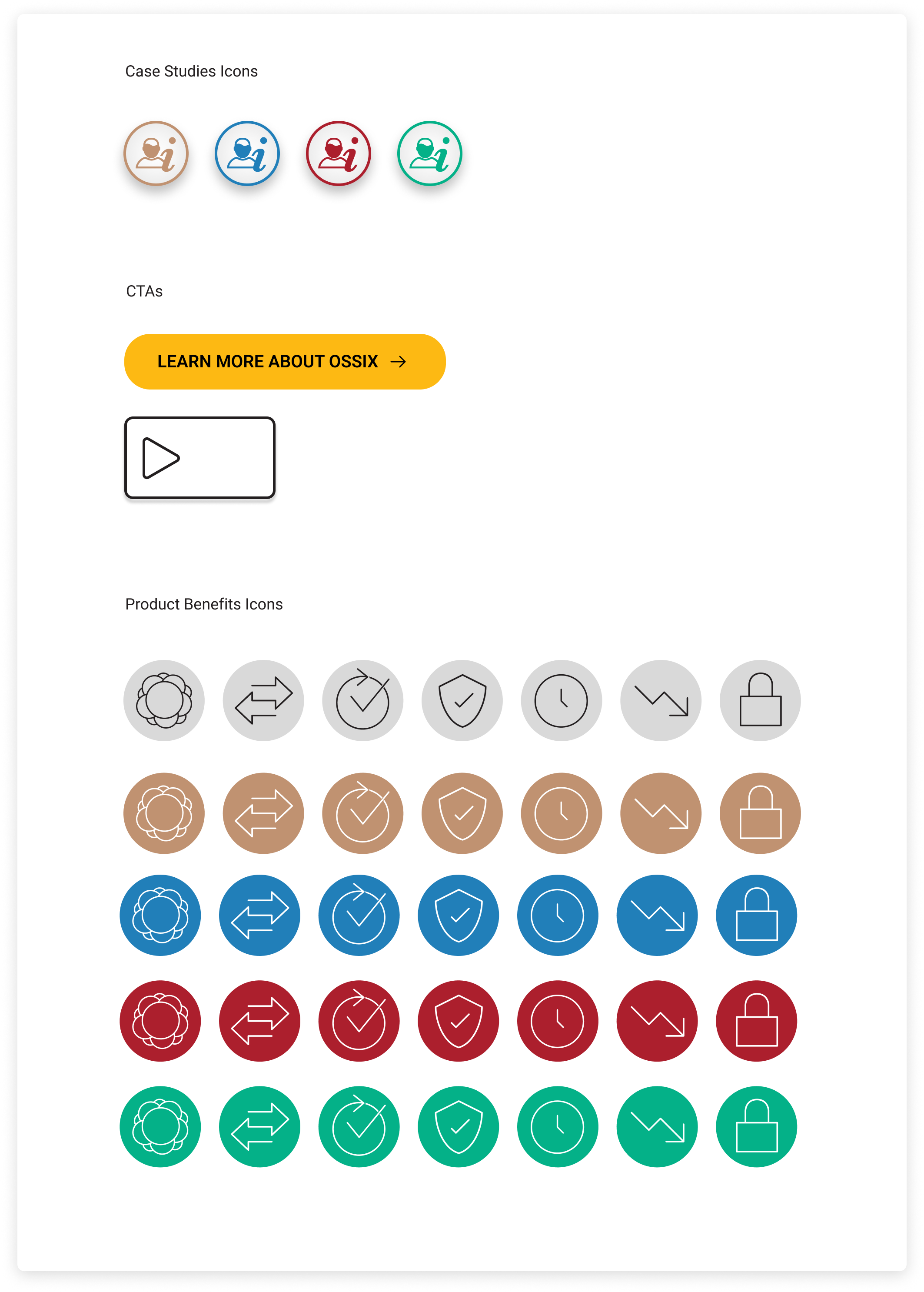
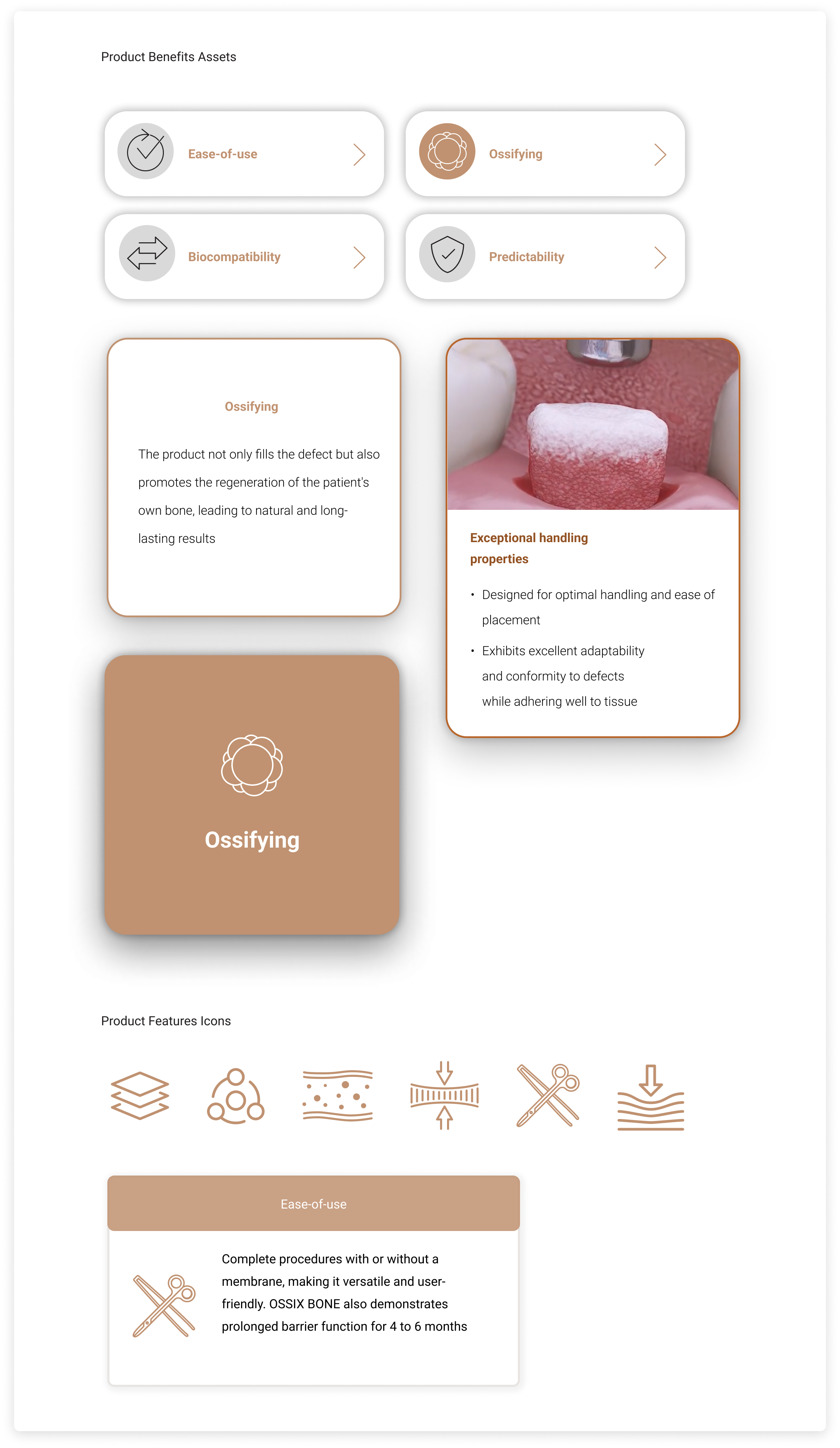
A color pallet was created with 1 primary color for each product section and a unifying color for all primary buttons. The choice of typography was Roboto; a sans-serif font with great legibility and a variety of weights. Consistent use of brand colors reinforces the OSSIX brand identity and makes each product section easily recognizable.
Figma Protoype & Usability
The design and dev process in Figma was streamlined, and getting stakeholder feedback was quick and pretty seamless. Doing the usability testing in Figma allowed us to refine the UIs, excite the stakeholders, and enhance overall user experience before moving to the final development stage.